D3 football chart samples
Hi there. In preparation for the 2016 football season, I’ve been building charts for my favorite Alabama sports blog, Roll Bama Roll. I’ve done some football charting explorations already, but it’s been extra fun to see them come to life in a responsive, reproducible way.
More charts will be on the blog in the coming months, but I wanted to post a sample in the meantime. I'm using D3.js to render the charts with real data, and some modifications on the Skeleton framework for the rest of the page. The game was the Alabama vs. Michigan State 2015 Cotton Bowl. Enjoy.
A "successful" play, as defined by Football Outsiders, is basically when a play gains enough yardage to keep the offense on track, i.e., 50% of needed yardage on 1st down, 70% on 2nd, or 100% on 3rd/4th.
A "big play" (aka an "explosive play") has different definitions depending on the analyst, but I use a generous one: a run of ≥12 yards, or a pass of ≥16, is a big play.
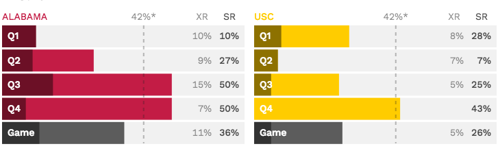
Success and big play rates
● Big play rate (XR) and ● Success rate (SR)
* NCAA average SR = 42%
Here's a simple application of success metrics in a game. Quarters aren’t the most refined unit of game time you can examine, but they're easy and there’s already contextual understanding. Here, it’s interesting to see that while the game was consistently lopsided on a success/efficiency basis, the big play rates trended the other way.
These two bar charts are actually the same D3 function with the team names, filters, and colors pulled in as arguments. This saved me some lines of code in the JS file, but it pulls from the source (a hosted .csv file) twice, which isn’t optimal. At some point I’ll rebuild it to avoid that overhead.
Plays by outcome
● Unsuccessful, ● Successful, and ● Big play
The gameflow dot-plot-like chart was prominently featured in my original piece about football charting (where the dots look much more dot-like). The quarter quintiles help show a more granular “flow” to the game by breaking down quarters according to game clock (15:00 left, then 12:, 9:, 6:, 3:). The resulting illustration is interesting, but I’m not sure that it’s superior to the prior chart, in part because people can interpret the columns as offensive drives (which they're not).
I had to work around my D3 capabilities here a fair bit. For example, using rectangles instead of circles to represent plays: instead of rendering and arranging individual plays according to all the needed dimensions, I drew the quarter quintiles as cascading vertical bars (first the unsuccessful plays, then successful, then big plays), then drew the grid on top. I’m happy with the result for now, but would like to later re-build the dot plot so that I can introduce interactivity (e.g., hovering over a play brings up the play description) and layer on play-specific info.
Running and Passing
● Run rate (runs ÷ total plays), cumulative
Success rate for ● runs and ● passes, cumulative
* NCAA average SR = 42%
The line charts were fun for a few reasons. For one, Alabama football fans love when the team runs the ball, so it’s funny to see that passing was the more successful endeavor in this game (and how the offensive coordinator followed that trend by passing more often, up until the team was way ahead).
Also, this is the kind of chart where D3 is the most helpful: drawing multipoint SVG images (like a polyline) and placing them on HTML. A developer friend even said that bar charts might be executed better in pure HTML, rather than even using SVGs. Be that as it may, I’m happy with how things have progressed.